Synchronising a parent company and its brands.
Kernel are a recruitment group with 3 sub-brands. All able to stand alone, but needing something to tie them all together.
Services
- Brand design & guidelines
- Website design


Different but the same
The development of the 3 sub-brands (Catalyst, Dartmouth, Pure) came before the parent brand Kernel. Kernel was intended to take all 3 subs and create 1 clear image to capture them all.
The brief for the 3 brands was that they need to have something in common and fit together. Variations of shapes were explored, some abstract and some puzzle-like. The shape needed to be able to exist by itself but also fit with the other two, finally landing on 3 typical shapes that we can make Kernel’s own.


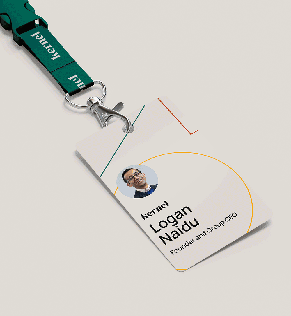
Corporate personality
Website design started with their central brand with the biggest operations, Dartmouth. The style used for the Dartmouth site was copied over to Catalyst and Pure, maintaining that connection between them.
Kernel required a different approach to the design. Elements from the 3 sub-brands are visible throughout the Kernel site, but it was important that Kernel had that ‘difference’.


