Giving the legal industry
some personality.
The challenge of this project was creating a classic minimal look with slight elements of personality.
Services
- Brand design & guidelines
- Website design

Using the obvious
Instead of going down a path of complex graphic elements and small details that could provide the balance the client is looking for, I looked to the more in-your-face options. The typeface for Hunters Legal, Gloock, proved to be a game changer of contrast.
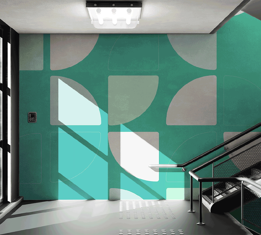
Choosing muted blues, greens, and a yellow accent allowed pops of colour against the often used dark backgrounds.
Lines, partial boxes, and the occasional logomark graphic let the brand toe the line of both bold and minimal without needing to pick a side.


Translating to web
The concept of a large, wide, blocky site offset with intricate line work resonated with me when drafting up the website design.
I designed with the intent of giving every line a purpose and creating an easy content flow.


