Taking an established
company into the new era.
Bold Group is a digital agency that was looking to expand into new client sectors and needed the global feel to match.
Services
- Logo design
- Brand design & guidelines
- Website design

What does
Bold mean?
To be loud, strong, brave, not afraid to take up space. A logo reflecting this allowed a few different avenues to be explored.
I went into use of curves, hard angles, abstract shapes, and boxes.


Thinking bigger
Developing a B using negative space became the challenge of this logo. While I was quite happy with earlier options of this concept I didn’t want to leave any stone unturned.
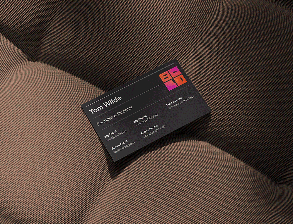
The final B was selected but then came the next step; what about the wordmark? Options using plain text were explored, ultimately it was realised that using these boxed letters encapsulates the word Bold better than any other style.

Developing the
whole brand
Since its inception Bold has always been known for using orange, something many of their clients would compliment and want to emulate. Bold was already going through a big change with their brand, keeping the colours consistent but with a fresh twist felt like the right way to go after they had built up recognition.
Bold Group were certain about one thing from the start of the project; they want to see gradients. Gradients are a well established feature in the brand world, it’s about how you apply it that can set it apart from the rest. Freeform gradients are able to produce more ‘feeling’, the illusion of movement in a static image. To emphasise this I added a grain texture to all gradients for depth and a real tangible feeling.
The gradient was then used quite sparingly, I did not want to let the brand rely on the gradient as there will be instances where it can’t be used. Knowing the gradient can’t do all the leg work, I paired it with intentional text placement and line divisions.


Shape it,
don’t adapt it
Two lines from Bold’s previous website content stood out to me: Shape it, don’t adapt it; Build something to be proud of. These two lines felt like a great way to sum up everything this new branding was trying to achieve and what Bold does for its clients.
I developed multiple starting points that could take the website design into different vibes but all built to reflect those two taglines. After landing on the final landing design the rest of the website that followed the same theme with the goal to make content and services as clear and accessible as possible.


Streamlining
Bold Group’s previous website was overflowing with content from case studies to testimonials to services that weren’t clearly stated.
The key was to keep this content but make it much more easily digestible for the user, not presenting them with a wall of 20 variations of the same content, and giving a clear distinction between elements.


