Depth, style, and conversion.
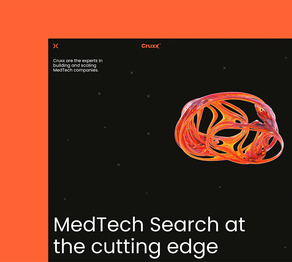
Cruxx is a MedTech recruitment company working with high profile clients to increase their capital and fill their roles.
Services
- Website design
- Marketing Collateral

The brief
Unsatisfied with their previous site, Cruxx wanted something they could proudly use as a sales asset that showed off what’s important to them; case studies and their wider work.
Cruxx have a wealth of big clients boasting great reviews and increased capital, couple this with their growing podcast and they have more to show off that an average recruiter.

Offering
Cruxx have 3 audiences: clients, candidates, and the MedTech community. Ensuring all 3 were paid attention to was a focus of this site. Being as clear-cut as possible gave audiences no doubts about what Cruxx has to offer.


Adapting
During website design I added to the Cruxx brand with 2 new shades of grey and box styles. Focus pivoted from web to marketing and client facing collateral once development was complete, the new brand elements and web style needed to be able to shift platforms.
